Downloads
You can download material related to the Planetary Health Check and the Planetary Boundaries below.
Images and figures can be reused under the Creative Commons: CC BY 4.0 license.
Please credit as: Planetary Boundaries Science (PBScience), [year], e.g. 2026 for the latest report.
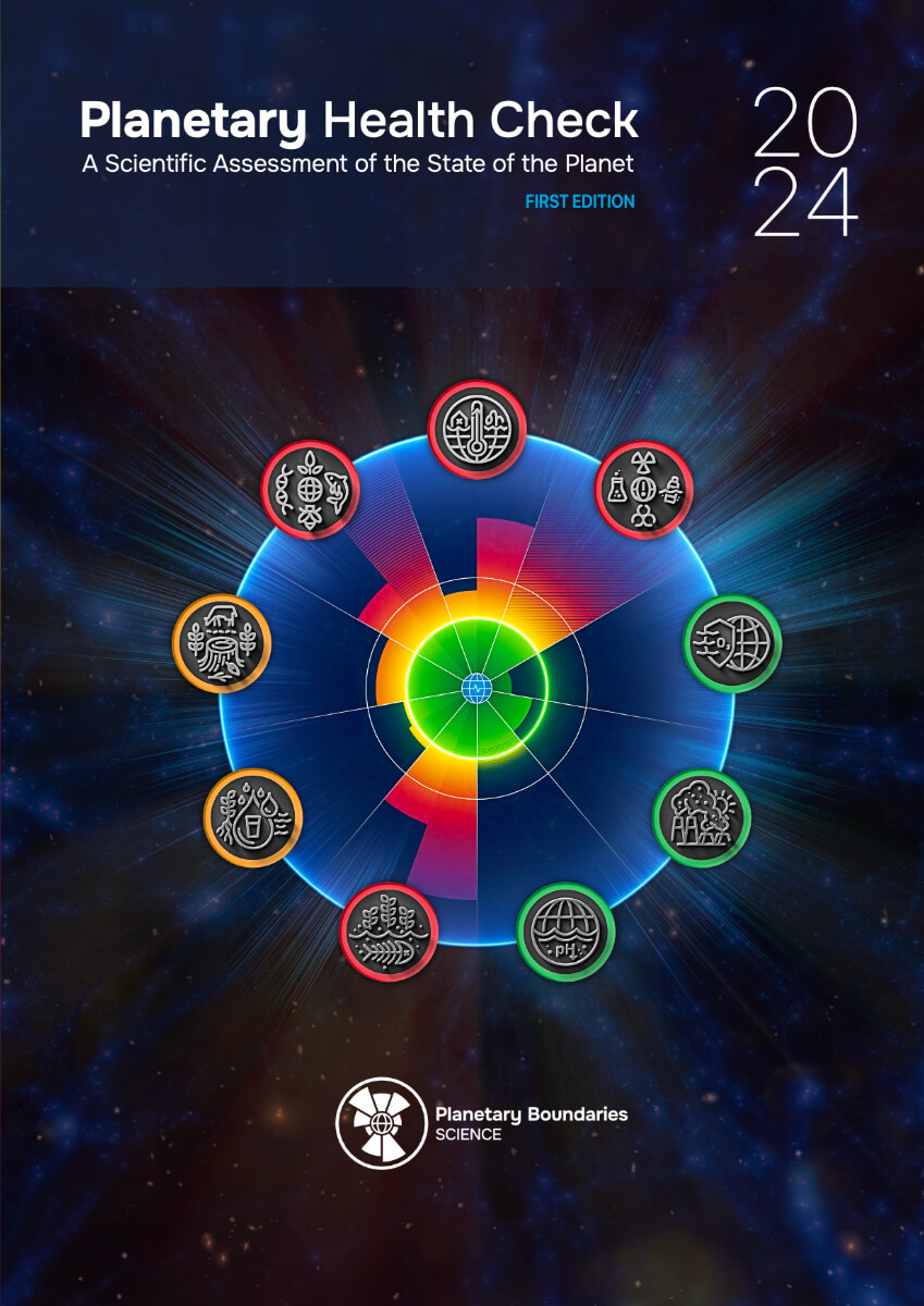
Planetary Health Check 2024
A Scientific Assessment of the State of the Planet
This inaugural annual report represents a crucial step in monitoring and safeguarding Earth's stability, resilience, and life-support functions — what we refer to as "Planetary Health".
Download
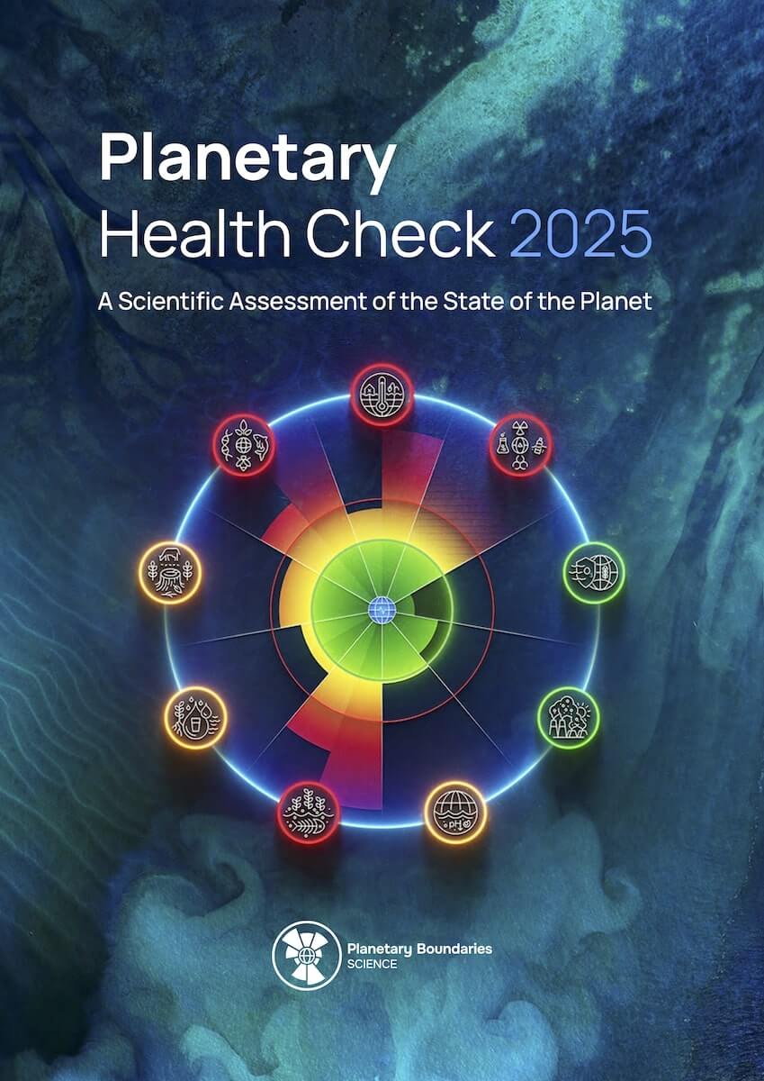
Planetary Health Check 2025
A Scientific Assessment of the State of the Planet
The latest assessment of Planetary Boundaries science is contained in the second Planetary Health Check report, developed by the Potsdam Institute for Climate Impact Research.
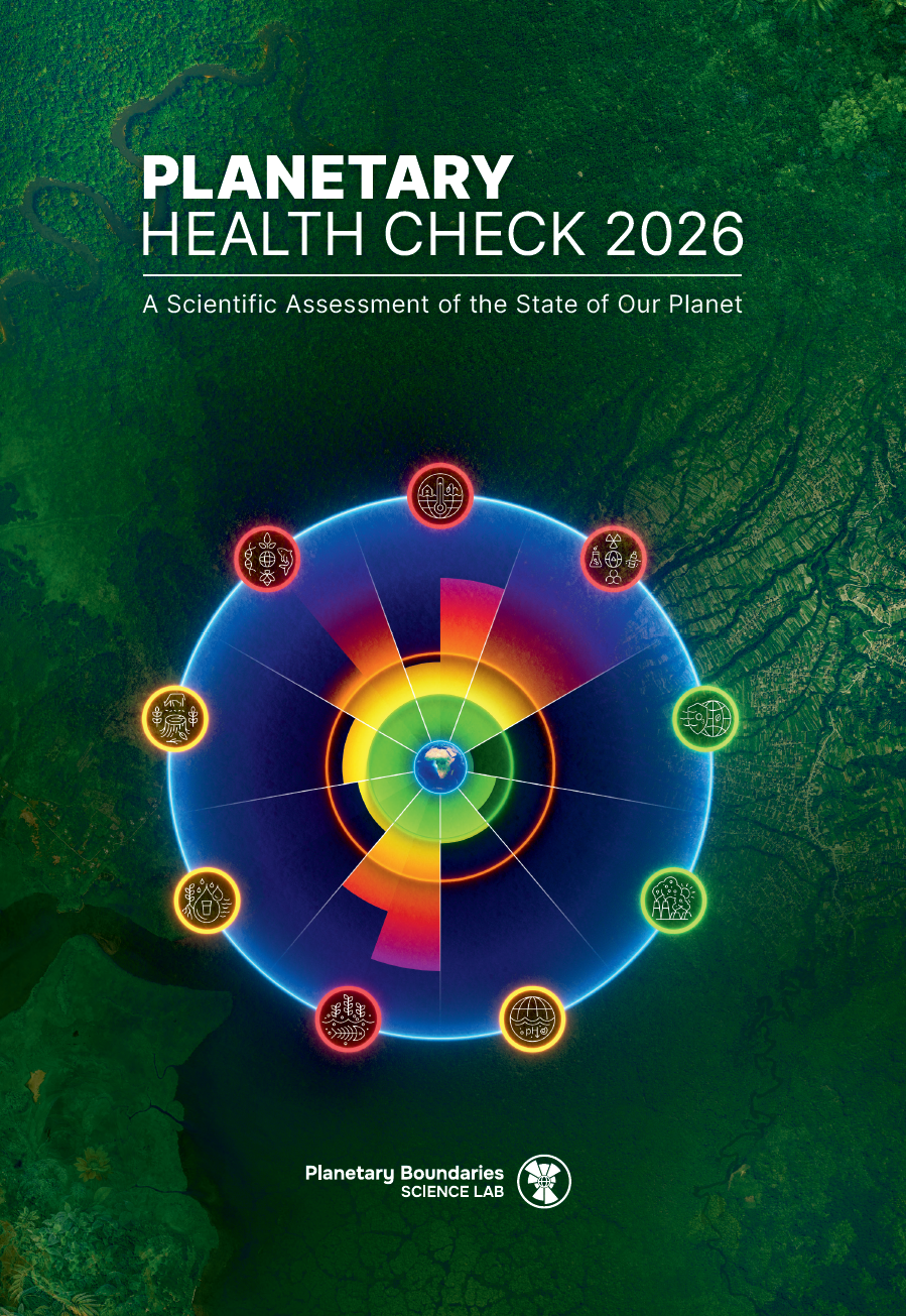
Planetary Health Check 2026
A Scientific Assessment of the State of the Planet
The latest assessment of Planetary Boundaries science is contained in the second Planetary Health Check report, developed by the Potsdam Institute for Climate Impact Research.
All Downloads
Filter by Languages
Filter by Year
Filter by Type
A Rough Guide to Planetary Boundaries
A two-pager explaining the Planetary Boundaries in simplified language
Planetare Belastungsgrenzen kurz und knapp
Ein zweiseitiger Flyer, der die planetaren Belastungsgrenzen in vereinfachter Sprache erklärt.
Individual PB icons [.zip]
Individual PB wheels [.zip]
Individual PB bloodtest diagrams [.zip]
FIGURE 1: Humanity’s journey on Earth
Global temperature and the Great Acceleration from 500,000 years before present (BP) until 2100. The figure is a composite of different data sets including paleo data estimates, recent measurements, and future projections. [cont. in report]
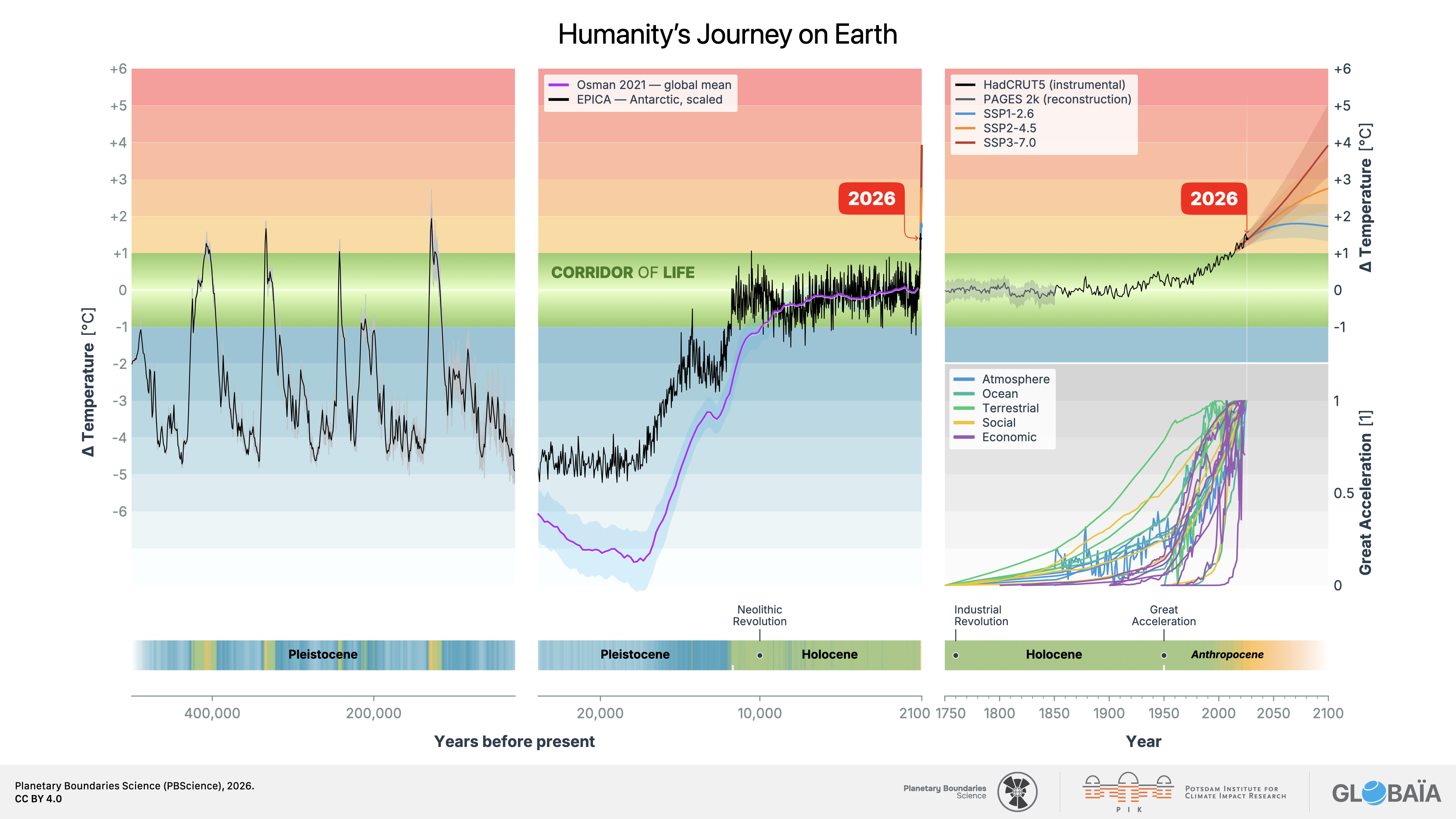
FIGURE 2: The Great Acceleration – Recent trends in the Earth system
This updated figure extends the original “Great Acceleration” analysis by Steffen et al. (2015) with the most recent data available for the 2026 assessment, incorporating new datasets and, in some cases, revised or additional indicators. [...] Together, these trajectories reinforce the urgency of respecting the Planetary Boundaries to safeguard Earth’s resilience.
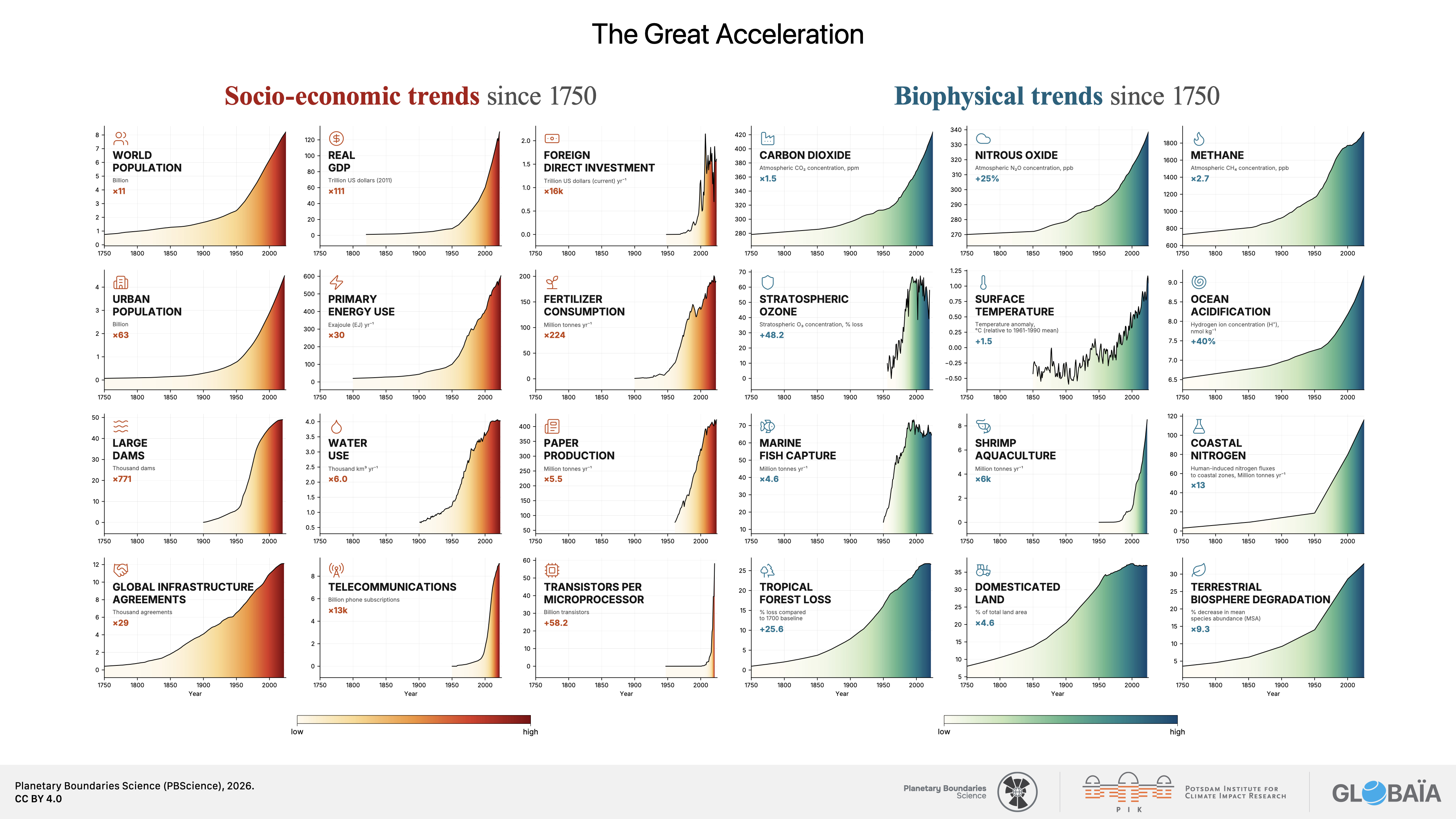
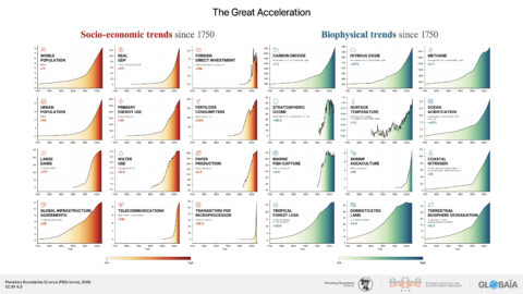
FIGURE 3: The iconic Planetary Boundaries (PBs) diagram
The iconic Planetary Boundaries (PBs) diagram visually represents the current status of the nine PB processes that regulate our planet’s health. Each process is quantified by one or more control variables based on observational data, model simulations and expert opinions.
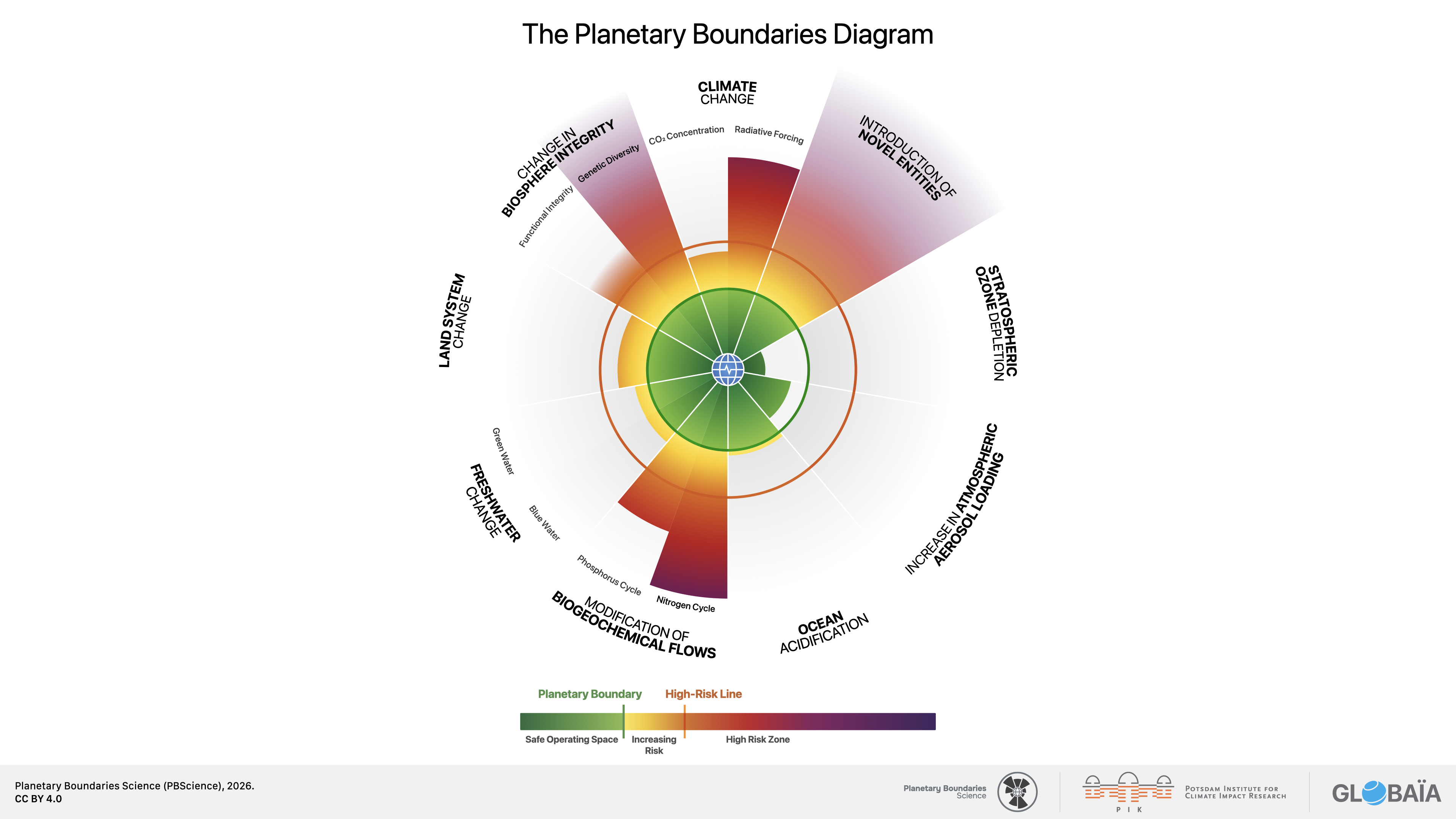
FIGURE 4: Planetary health at a glance
Just as a blood test provides insights into a human body’s health and identifies areas of concern, this Planetary Health Check evaluates the 13 control variables across the 9 Planetary Boundary (PB) processes to report on Earth’s stability, resilience, and life‑support functions: the overall health of our planet. On the lower colorbar, a classic boxplot summarizes the distribution of all 13 control variable values at once. [cont. in report]
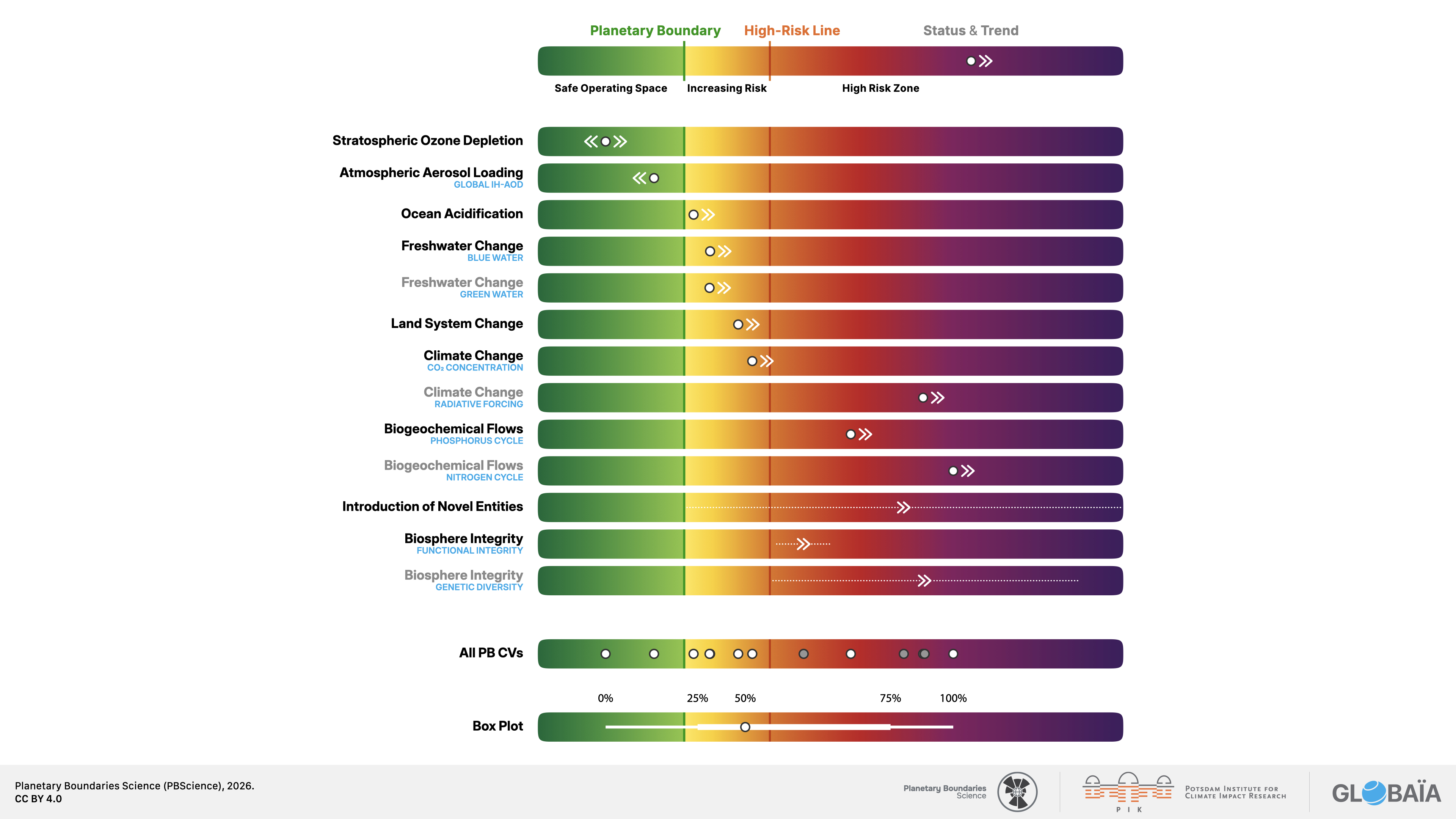
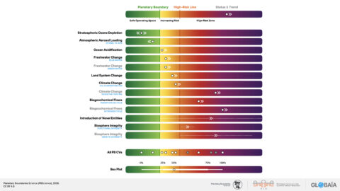
FIGURE 5: The dynamic Planetary Health Check symbol
The dynamic Planetary Health Check symbol represents the summary of each year’s findings. The stylized boxplot (white lines and blue dot) describes the distribution of all PB control variables (which are individually shown in FIG. 3 and 4). The thin line represents the full range of all control variable values, the thicker line represents the 25–75% range of all control variable values and the dot represents the median of all control variable values.
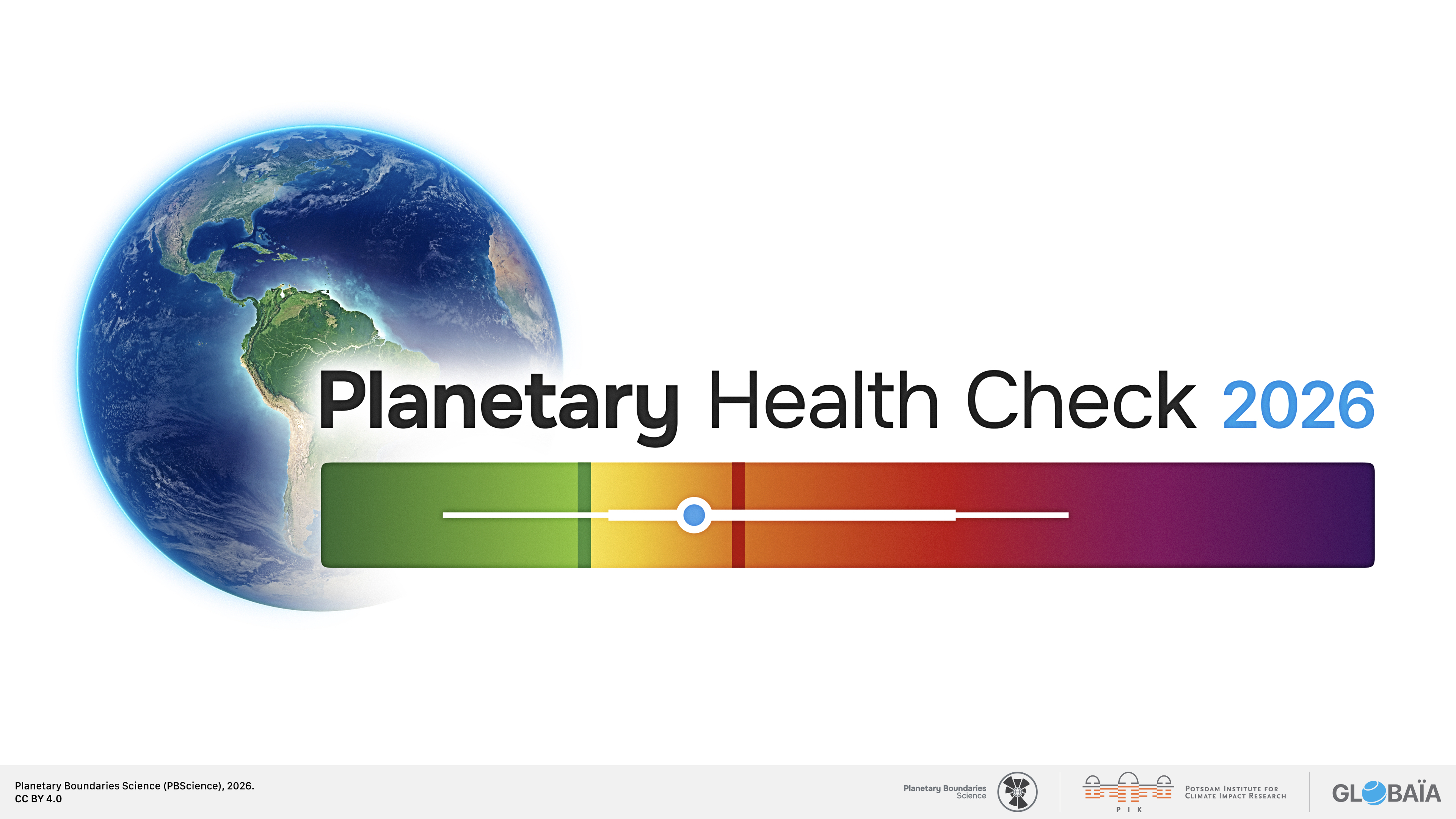
FIGURE 6: Global mean column-averaged atmospheric CO2 concentration (XCO2)
Panel (A) presents the global mean column‑averaged atmospheric CO2 concentration (XCO2) over land from 2003 to 2023, based on satellite observations with a spatial resolution of 5° × 5°. Panel (B) shows the spatial distribution of XCO2 across both land and ocean for the year 2023. Overall, the data shows a sustained increase in atmospheric CO2 concentrations between 2003 and 2023. [cont. in report]
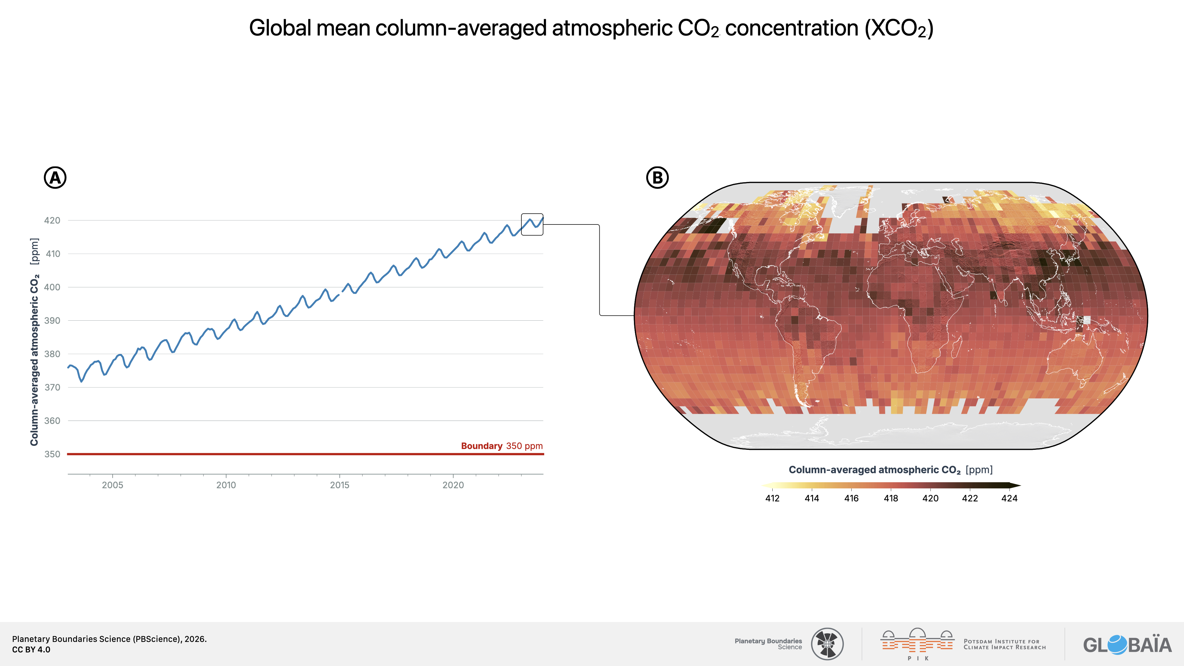
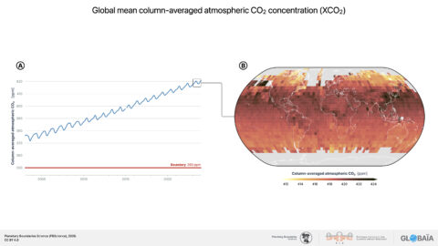
FIGURE 7: Global Ecosystem Atlas (GEA)
The figure shows the ongoing Global Ecosystem Atlas (GEA) effort to map 110 ecosystems across all realms of the biosphere (terrestrial, marine, subterranean, and freshwater) with the spatial resolution of 100 m × 100 m. This product is synthesized based on collected ground surveys as well as satellite‑based RS data supported by AI methods. At the time of writing, approximately 58% of the intended global coverage has been completed, and work towards full global coverage is continuing.
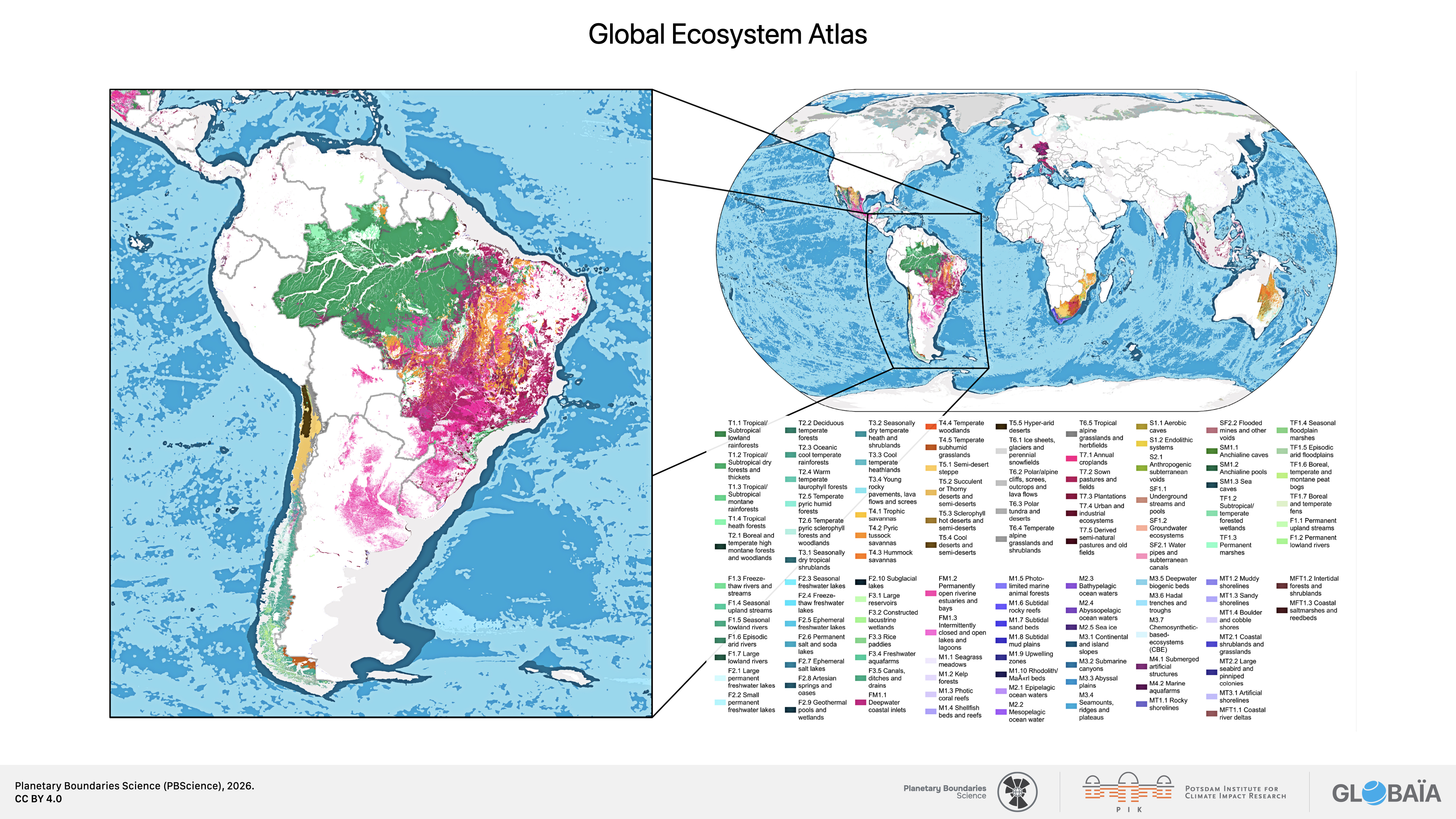
FIGURE 8: Planetary Boundaries form an interconnected causal network
The diagram shows the most significant and best-understood interactions among Planetary Boundary (PB) processes, together with major human drivers of boundary transgression. Arrows indicate the direction of an interaction, with their color identifying the source PB process. Arrow width represents the estimated relative strength of the interaction, while line style distinguishes reinforcing, dampening, and mixed or context-dependent effects. Numbered drivers can affect several PB processes simultaneously. The network is selective rather than exhaustive and reflects current scientific understanding.
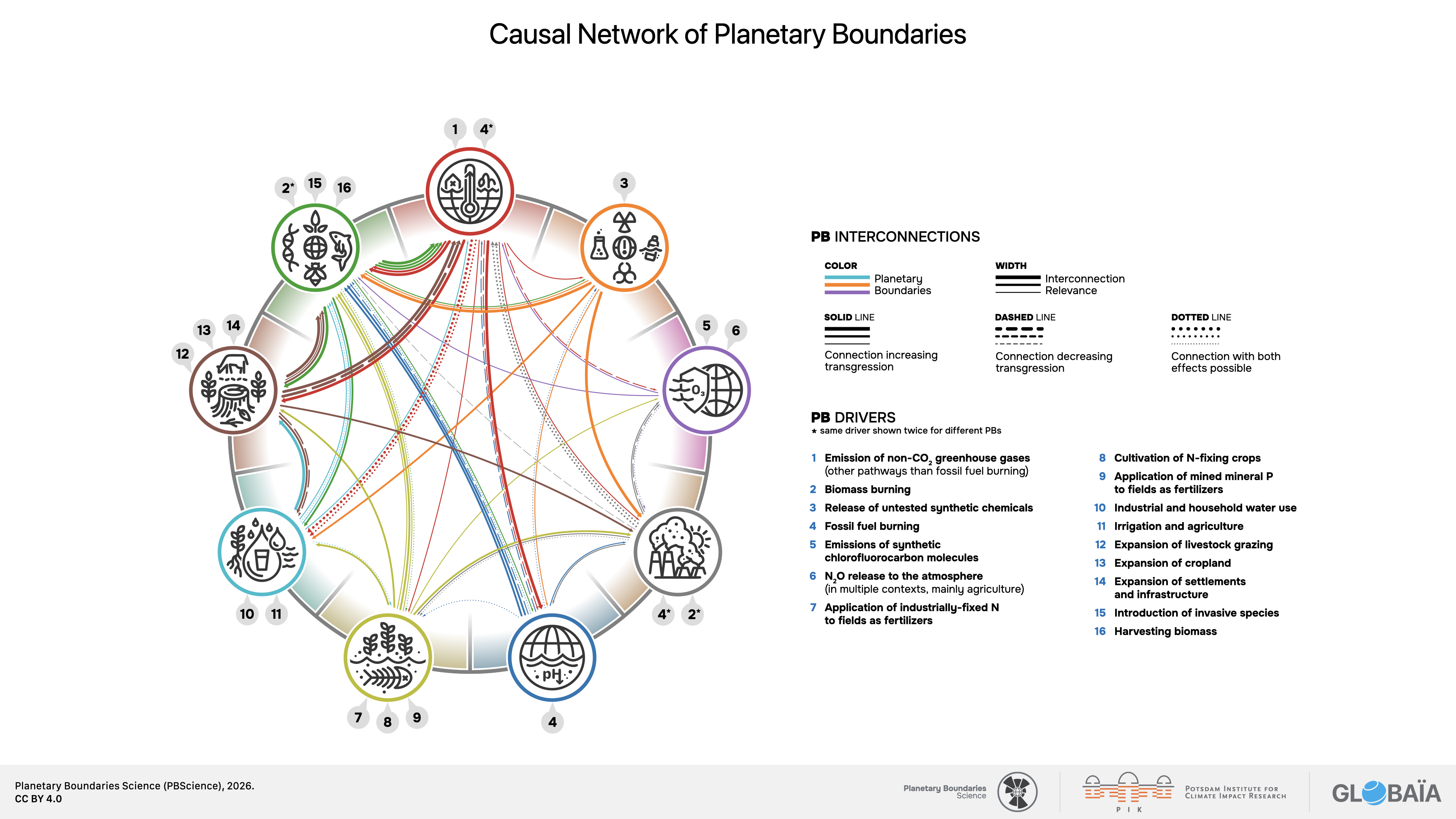
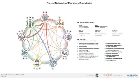
FIGURE 9: Safe and Just Earth System Boundaries
This framework was developed by the Earth Commission based on the Planetary Boundaries and so far has only assessed 5 of the 9 PBs.55 This figure uses a different normalization strategy than the Planetary Boundaries diagram shown in this report. However, it is clear that both frameworks agree which boundaries are transgressed.
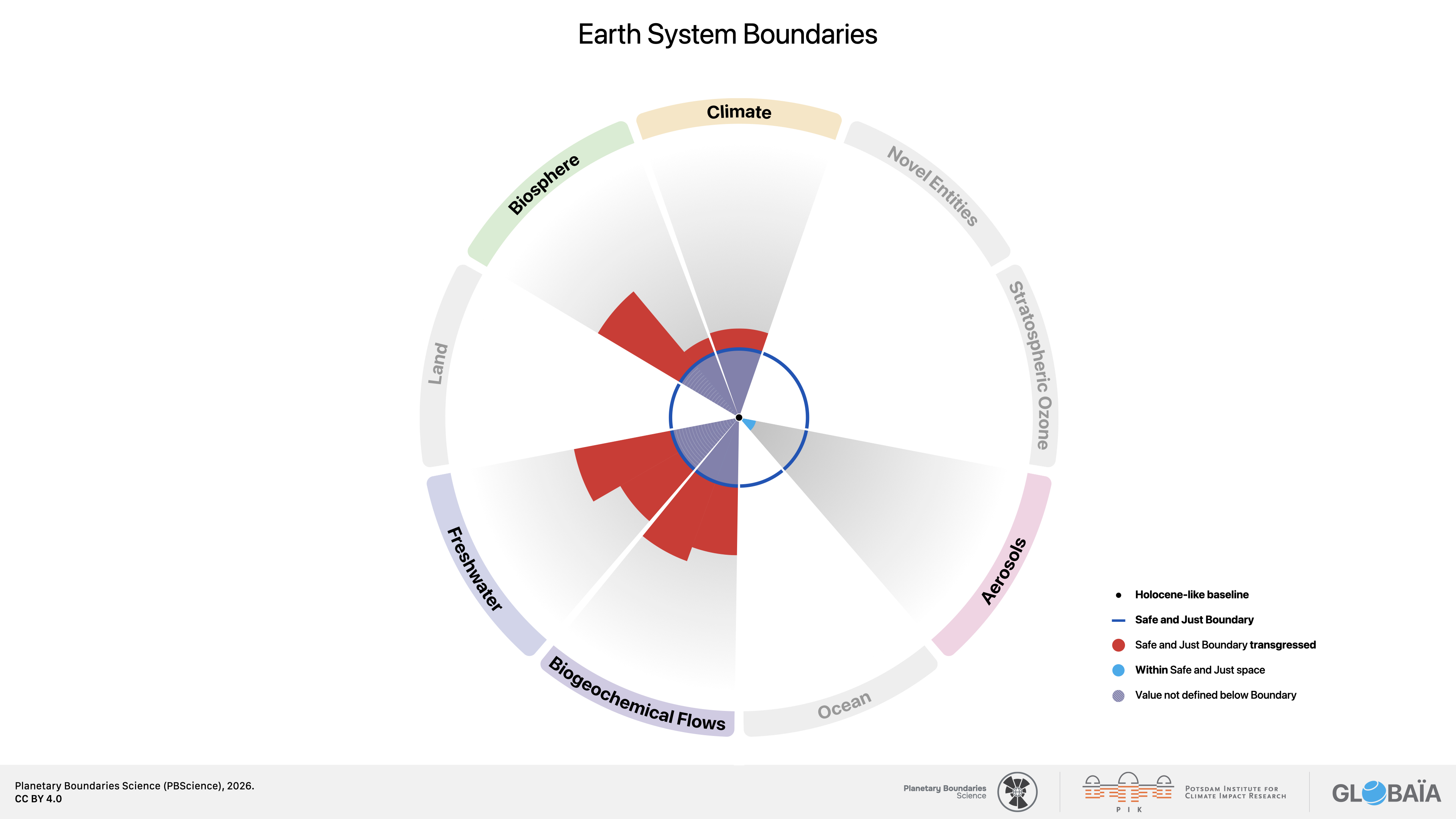
FIGURE 10: Approximate locations of the most impactful weather events between April 2025 and April 2026
Events which can be clearly attributed to human‑induced Climate Change are shown in red, events categorized based on evidence from similar events (“causal field”) are shown in orange. Events indicated in gray have either no causal field, or the literature in the causal field is ambiguous. Adapted from Otto and Raju (2023).
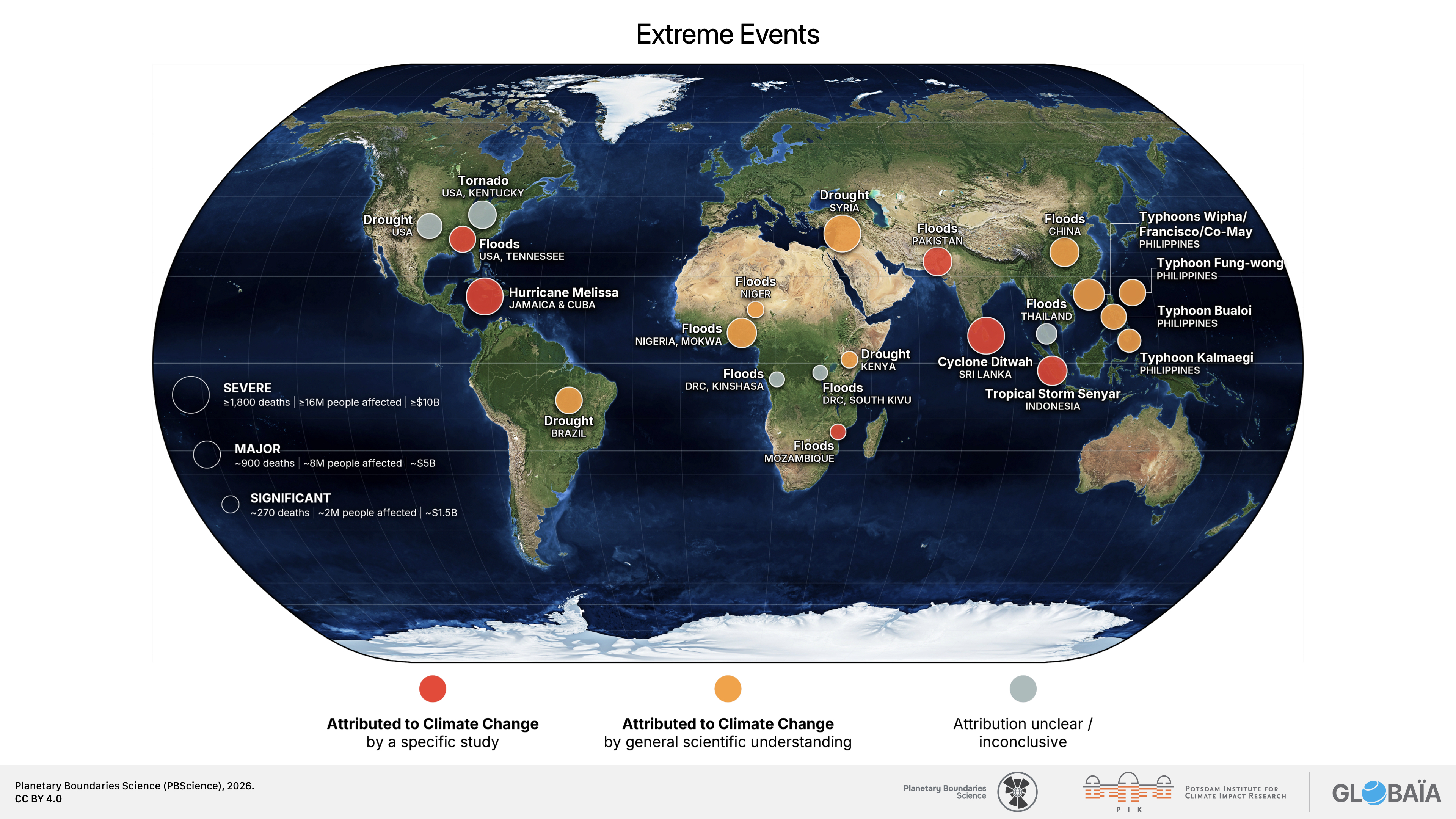
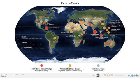
FIGURE 11: Stylized stability landscape of the Earth system
Tipping points and Planetary Boundaries are interconnected – both address Earth system stability, but they serve distinct roles. Beyond a tipping point, a system fundamentally changes due to a shift in feedback dynamics: When stabilizing feedbacks are dominated by destabilizing ones, they drive the system to a qualitatively different state, often abruptly and/or irreversibly. Where quantifiable, the Planetary Boundaries are set in a safe distance away from risks of crossing tipping points.
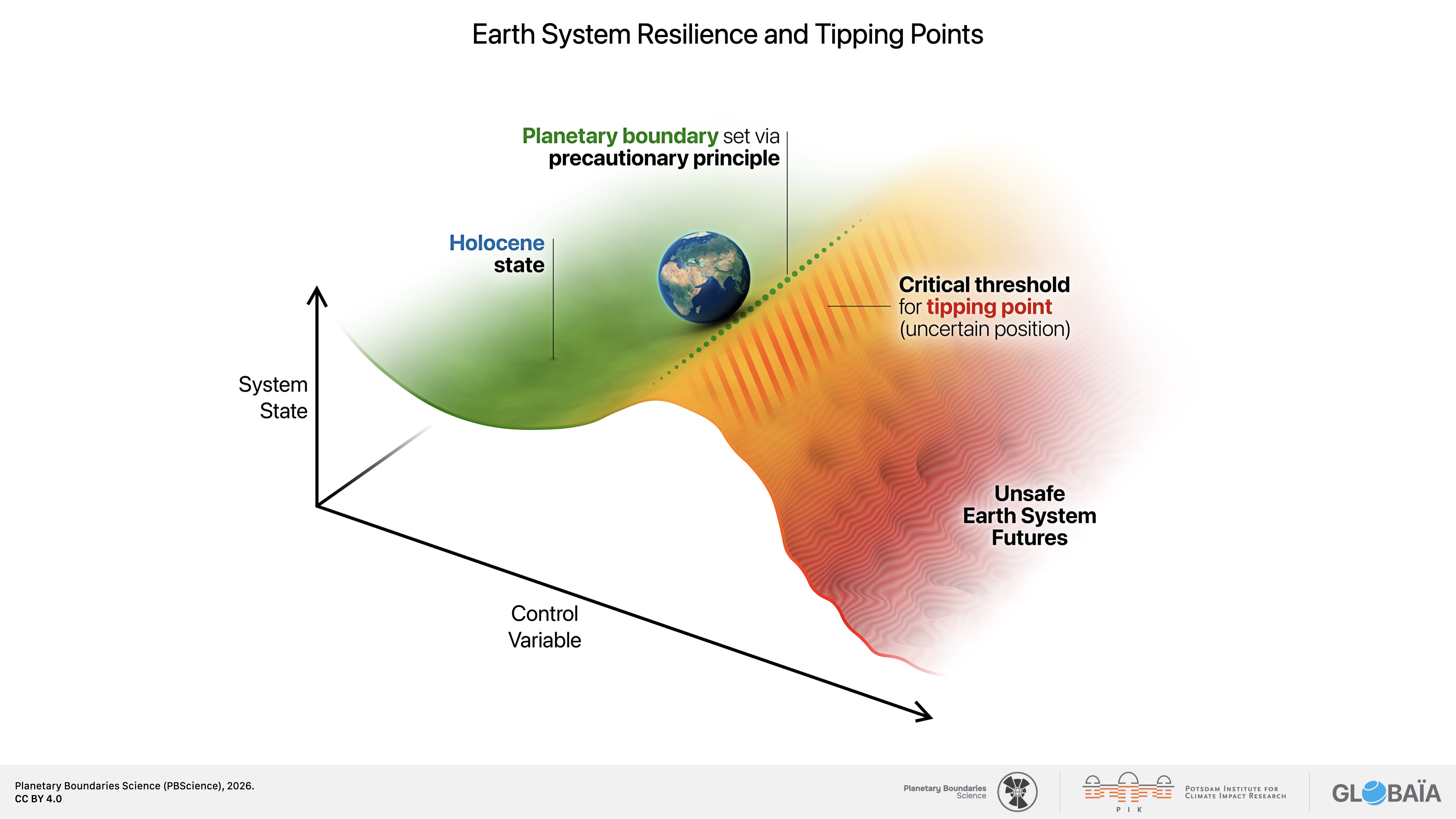
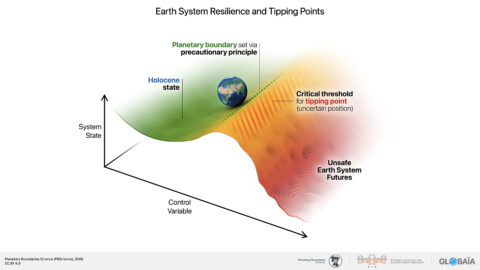
FIGURE 12: The global carbon budget and the fragile land sink
Panel A shows annual anthropogenic CO2 emissions and their partitioning between atmospheric growth, ocean uptake and land uptake, based on the Global Carbon Budget 2025. Positive values indicate emissions from fossil fuels and land-use change, while negative values show the fraction of emissions taken up by land and ocean sinks. Panel B translates this accounting into a simplified balance: Anthropogenic sources are partly offset by ocean uptake and land uptake excluding direct land‑use change, with the remainder accumulating in the atmosphere; the budget imbalance is shown as a residual accounting term, not as a physical sink. Panel C zooms into the green land-sink term. [cont. in report]
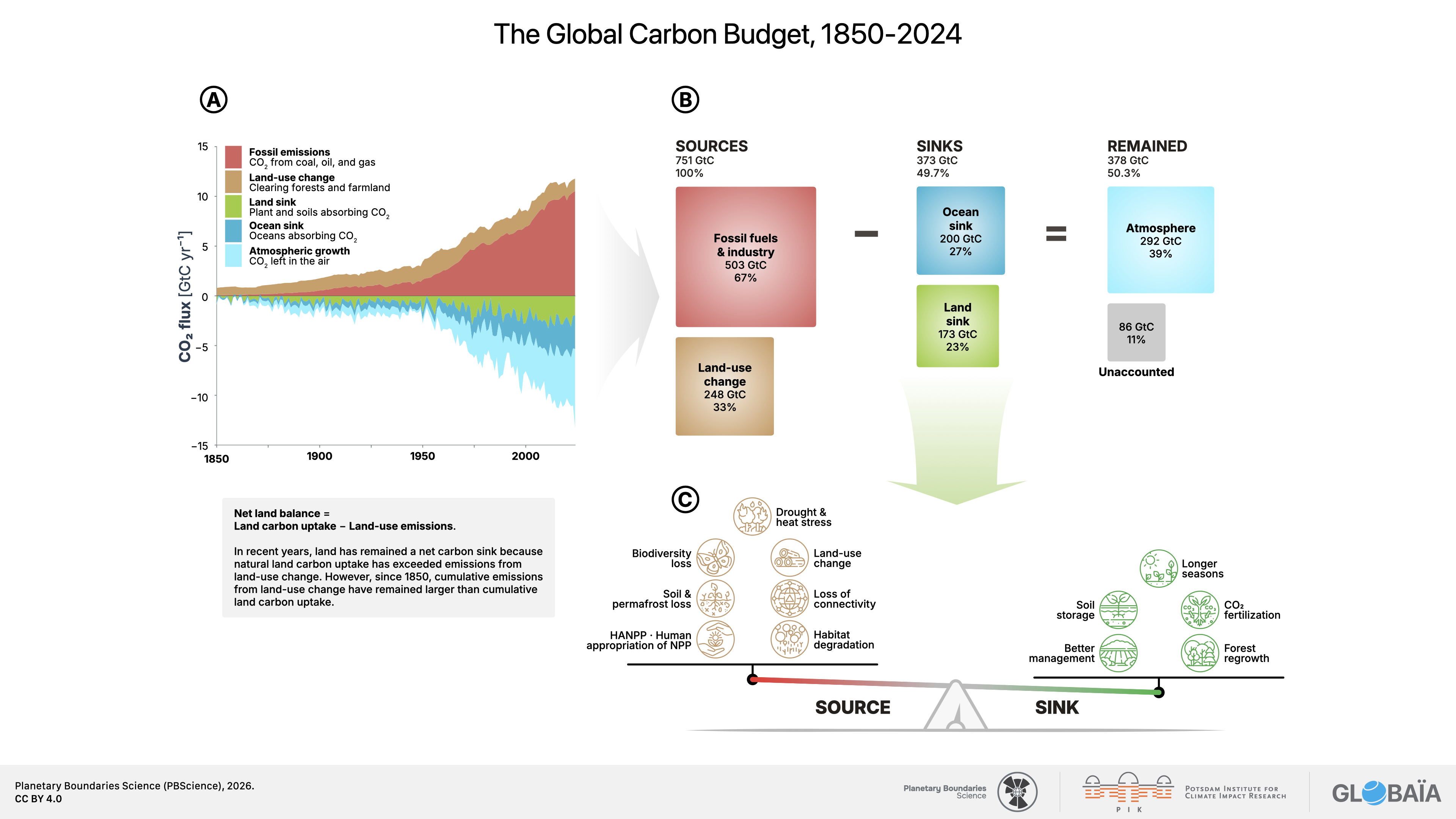
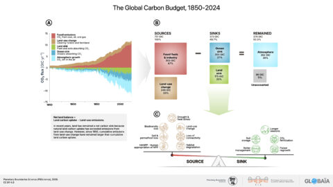
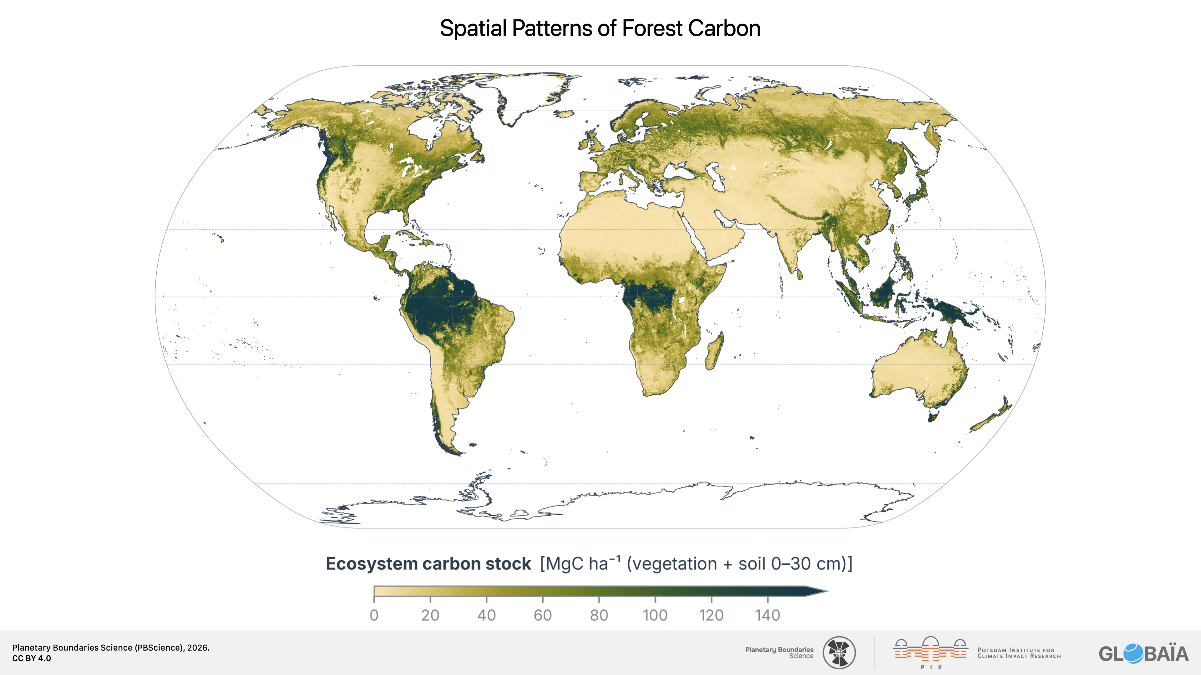
FIGURE 13a: Spatial patterns of forest carbon stocks
The map shows ecosystem carbon stocks in vegetation and upper soil layers, highlighting regions where large carbon stores are concentrated and where degradation or disturbance could turn existing carbon assets into future liabilities. [cont. in report]